

Credit photo: @oustao.deco
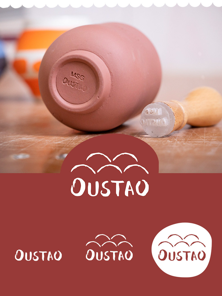
'Oustaou' means home in Provencal dialect. Such as Léa & Laura, the creators, the project was born in the warm and rich area of the South of France.
Oustao.com is a link between a region and its traditions, they are selling hand-made and unique decorative products in very small quantity. Highlighting the work of the people from Provence who create, paint or shape objects with passion and respect.
Within the first six months of its launch, the brand has reached +5K followers on social medias, and several publications on lifestyle newspapers like Vogue, Elle Decoration and Cosmopolitan.
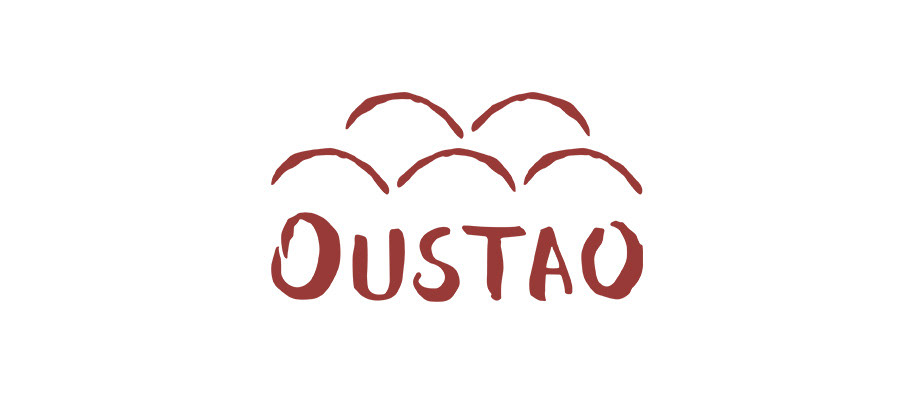
The logo was first drawn with watercolours, to create an unique and hand-made typography, reflecting on the craftsmanship.The roof tiles above "Oustao" and the terracotta colour are typical features of Mediterranean houses, creating a connection between the meaning of the name "home" but also the decorative products sold on the website.
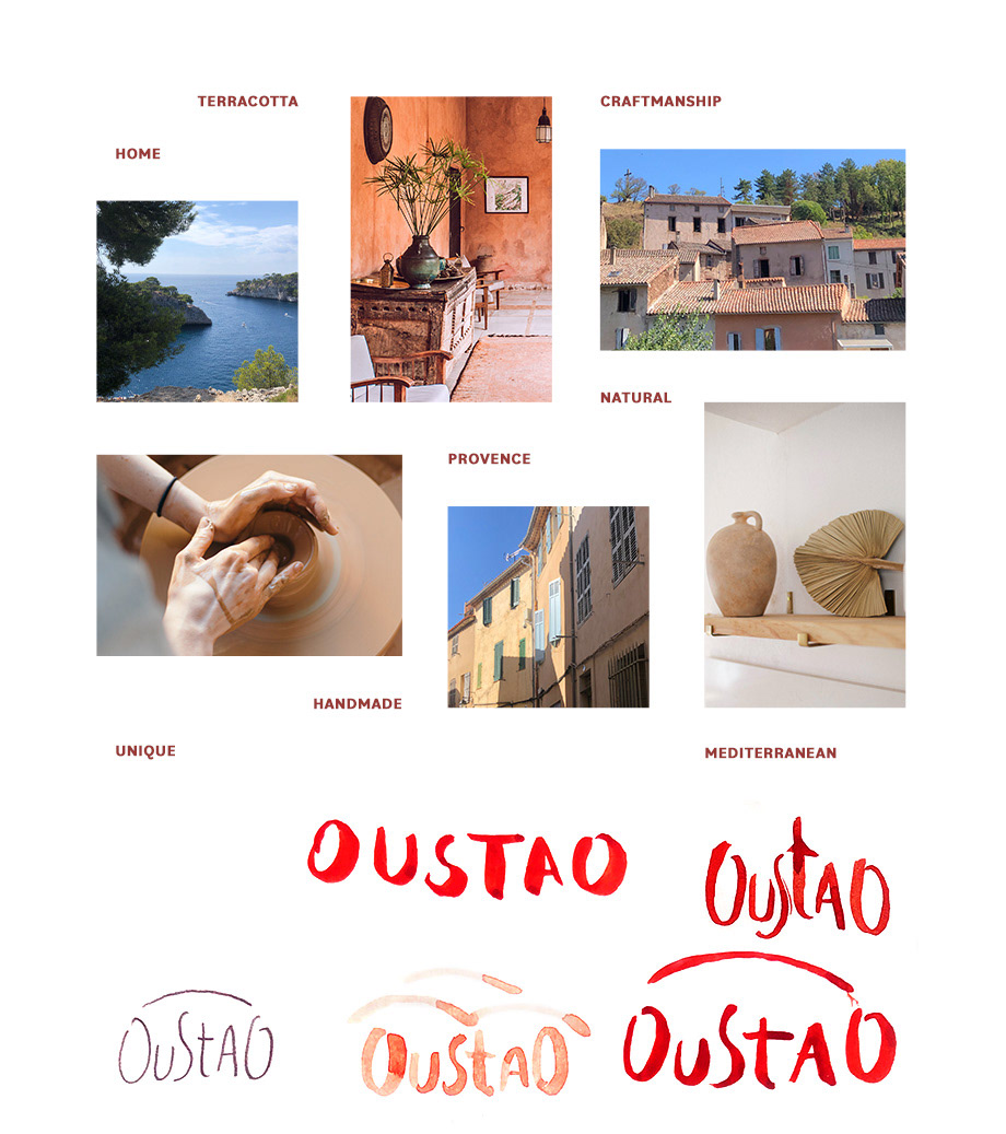
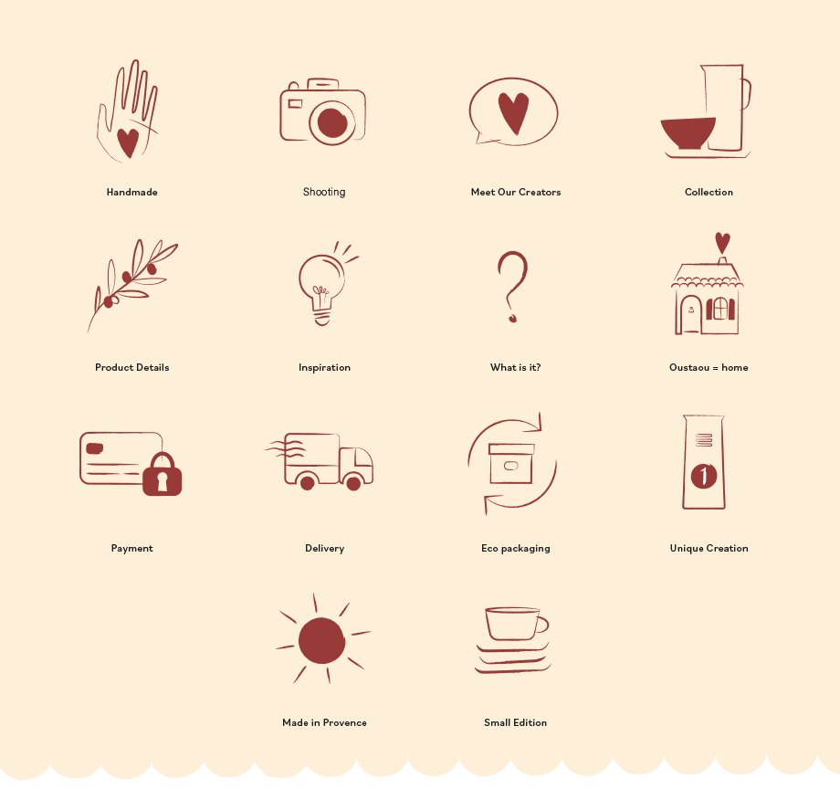
In addition, I've been designing 14 icons to categorise the content on social medias and the website, enhancing the brand identity and adding more consistency throughout the various channels.
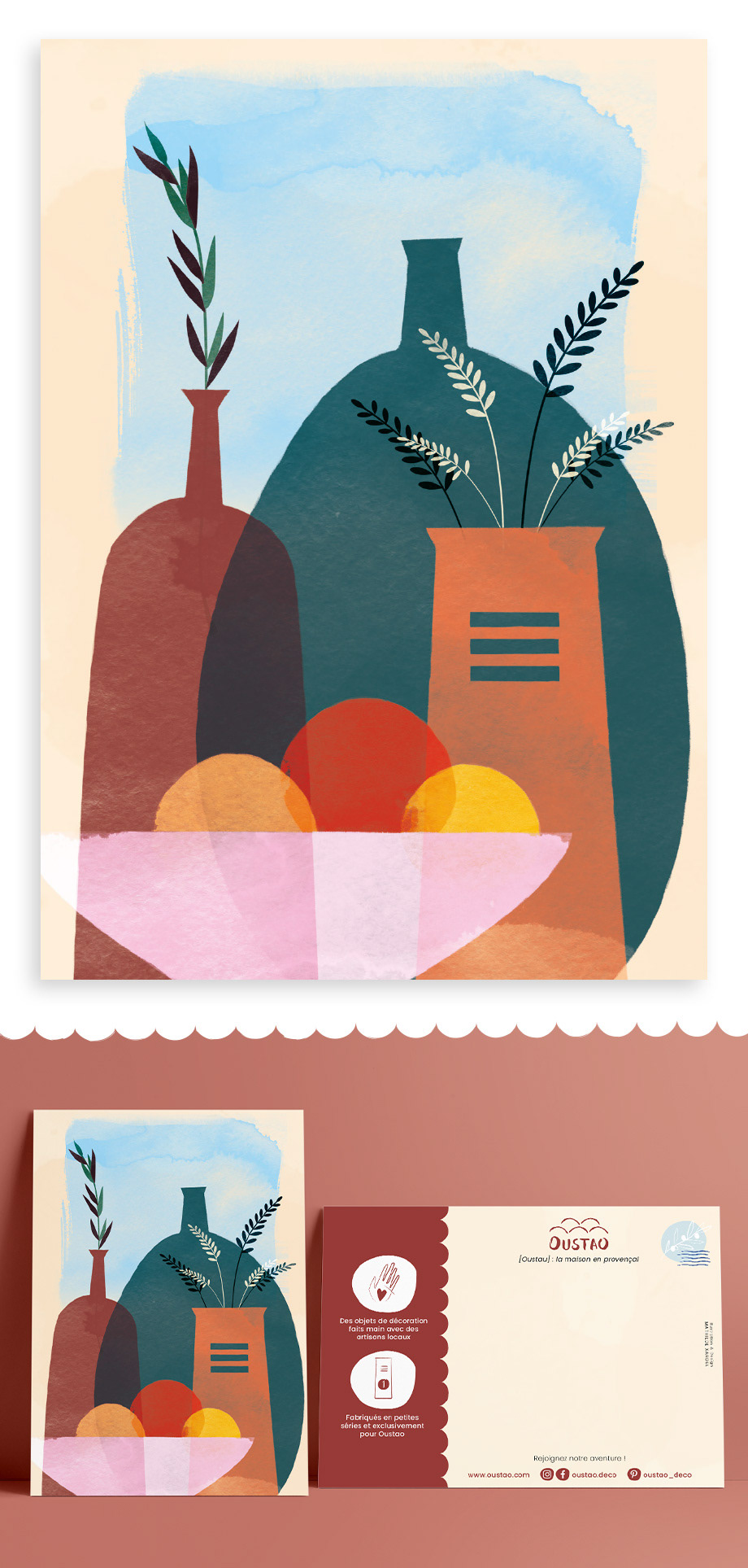
I've also created an exclusive illustration for a postcard. It will be added to each order with a personal note to thank the customers.